
How to Style Luxury Wall Art in a Living Room
Most living rooms get their wall art decision backwards. A piece gets bought first — because it caught the eye at a store, or matched a color someone liked — and only afterward does anyone think about where it should actually go, at what height, in what relationship to the furniture beneath it. The result, more often than not, is art that looks slightly wrong without anyone being able to say exactly why.
Styling wall art well isn't about finding the "right" piece in isolation. It's about understanding how a piece behaves in relation to the room around it — scale, height, material, and the negative space it leaves behind. Get those right, and even a single striking piece can anchor an entire living room. Get them wrong, and even genuinely beautiful art reads as an afterthought.
Scale Before Everything Else

The single most common wall art mistake is choosing a piece too small for the wall it's meant to fill. A modest 18-inch piece on an otherwise bare 10-foot wall doesn't read as minimal — it reads as leftover, like something's still missing. As a general guide, a piece hung above a sofa should span roughly two-thirds of the sofa's width, not a fraction of it.
Where budget doesn't stretch to a single large-format piece, the fix isn't a smaller piece — it's a considered grouping. Two or three works of varying size, hung with consistent spacing, can fill the same visual footprint as one large piece while adding more texture and depth.
Hang It at the Right Height
The standard rule — center of the artwork at roughly 57 to 60 inches from the floor — comes from museum hanging convention, calibrated to average eye level. It's a solid starting point, but it assumes a bare wall with no furniture underneath. In a living room, the more reliable method is hanging relative to the furniture: leave 6 to 8 inches of breathing room between the top of a sofa or console and the bottom edge of the artwork.
This keeps the piece visually connected to the furniture beneath it, rather than floating disconnected higher up the wall — which is the second most common styling mistake after undersizing.
Let Material Do Some of the Work
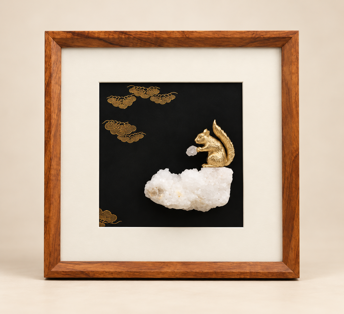
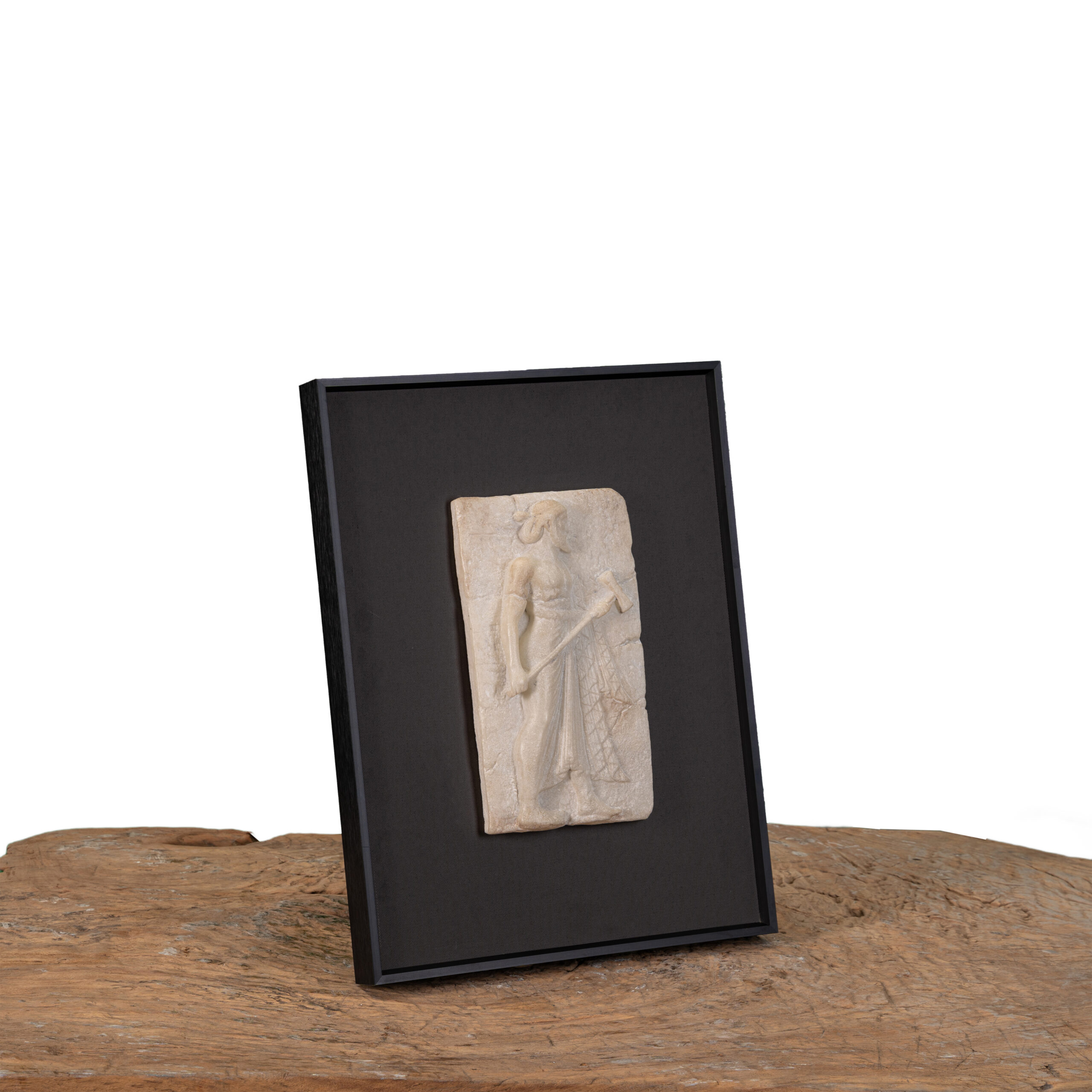
A flat print behaves very differently on a wall than a textured, dimensional piece — stone resin, carved relief, sculptural panels. Texture catches ambient light and shifts subtly through the day, which means a single well-chosen dimensional piece can carry a wall in a way that flat art, however striking the image, generally can't on its own.
This matters most in rooms with limited natural light or plain, unadorned walls — a textured piece gives the eye something to register even from across the room, where a flat print might recede into the wall color.
Conclusion
Good wall art styling comes down to a handful of decisions made in the right order — scale relative to the wall, height relative to the furniture, and material suited to the room's light. None of it requires expert training to get right, just a willingness to measure before hanging, rather than reaching for a nail the moment the piece arrives home.
Shop This Edit
Wall Art, Considered

Framed Horse and Chariot Relief Wall Art
₹20,900

Framed Multi-Figure Classical Relief Wall Art
₹20,900

Framed Classical Figure Relief Wall Art
₹15,900
Framed Classical Figure and Column Relief Wall Art
₹15,900

Framed Gold-Tone Copper Squirrel on Crystal Wall Art
₹8,500
Framed Gold-Tone Copper Squirrel and Crystal Wall Art, Companion Design
₹8,500
Luxury Wall Art for Living Rooms, Curated Online
Searching for luxury wall art for living room spaces usually surfaces mass-produced framed prints, sized generically and styled for no room in particular. At Valdéra Collective, our edit of luxury wall decor is built around framed stone-resin relief panels and sculptural copper-and-crystal wall pieces — dimensional, textured work designed to hold its own on a living room's largest wall, not just fill it.
Our range of luxury wall art spans large-format statement panels suited to anchoring a sofa wall, through to smaller sculptural pieces — like our framed copper-and-crystal artworks — better suited to a console, hallway, or a considered grouping. Each piece is hand-finished, which means genuine texture and tonal variation rather than a flat printed surface.
If you're planning a living room wall art refresh, the styling guide above covers the scale, height, and material decisions that make the biggest visual difference — and our edit above is a strong starting point for finding a piece with real presence, not just a decorative filler.
Common Questions